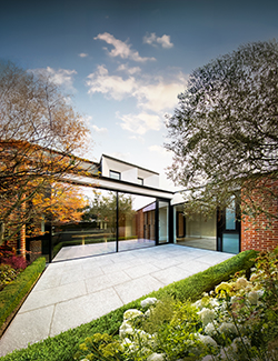
Park Avenue
Renovation and Extension of a Victorian home
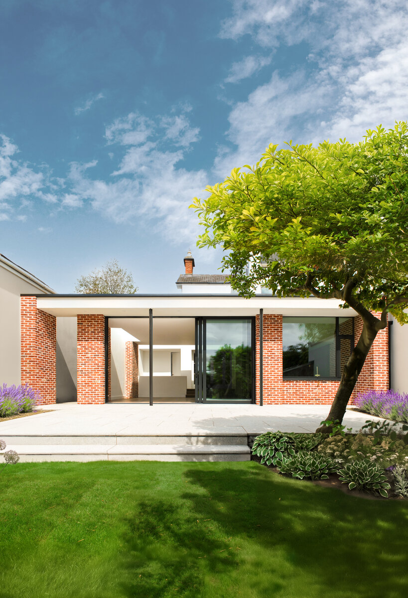
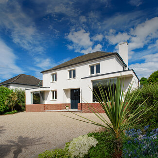
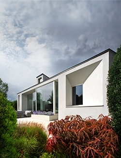
The extension to the side and rear of the house has created generous new spaces, including a kitchen, living areas, a home office, a children's play area, and essential amenities such as a utility room, pantry, and plant room.
The design thoughtfully addresses the long floor plan by incorporating a large lightwell between the original rear reception room and the new living areas, ensuring that natural light continues to permeate the heart of the home.
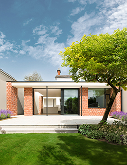
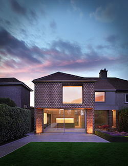
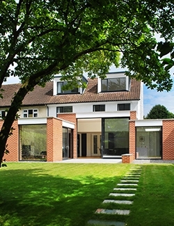
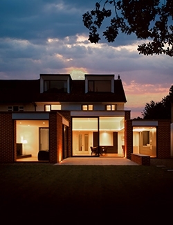
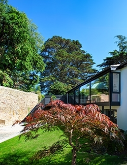
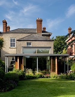
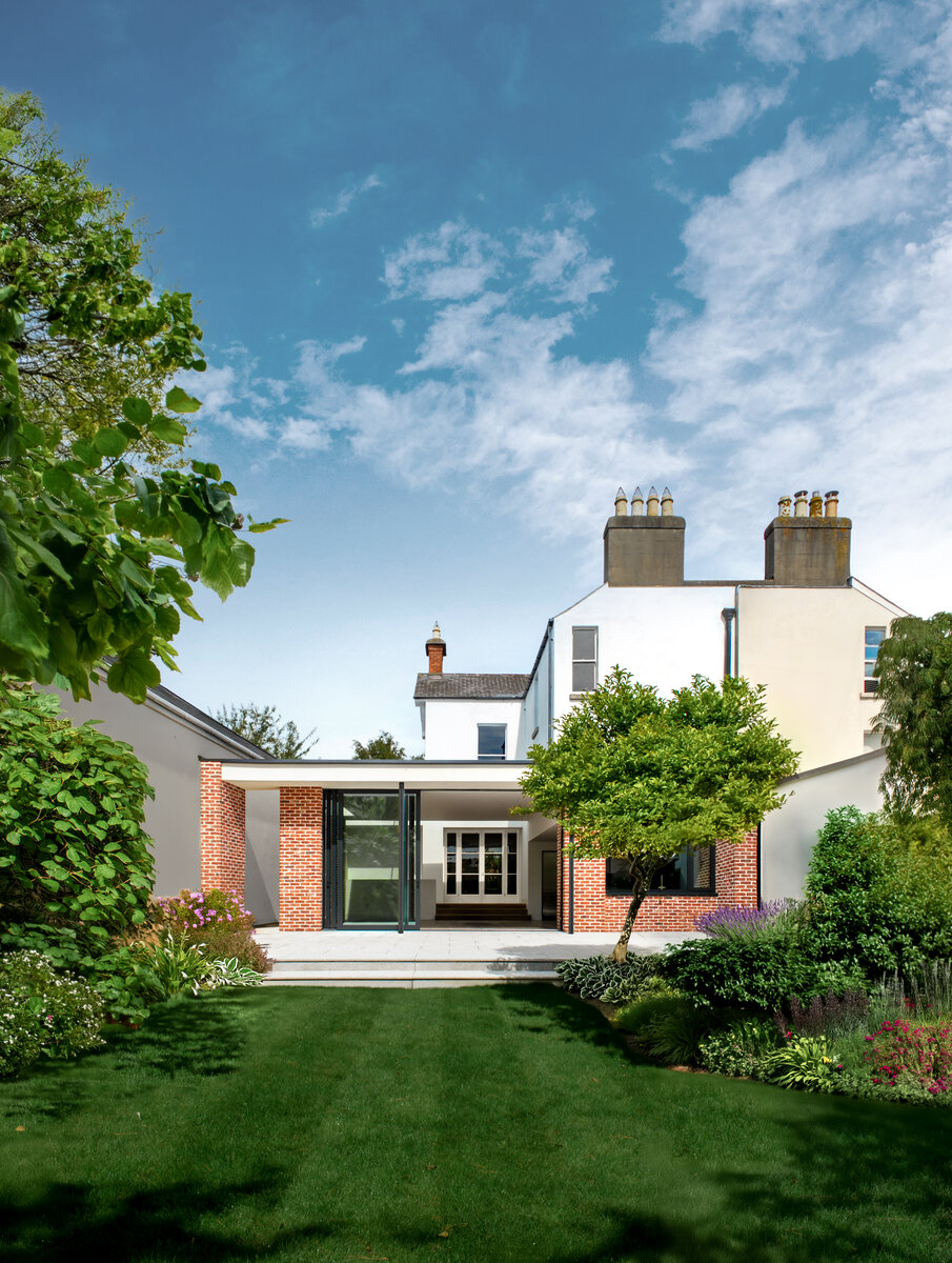
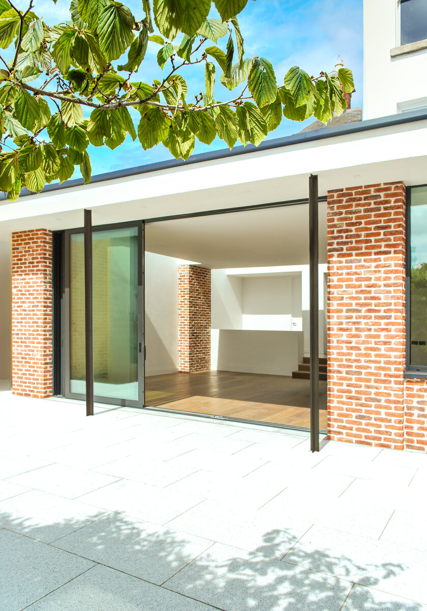
The new garden elevation, featuring three piered bays, is complemented by a deep porch that provides essential shading for the extra-tall glazing overlooking the garden, enhancing both comfort and visual appeal. This project exemplifies a harmonious connection between old and new, offering a home that is both timeless and perfectly suited to contemporary family life.
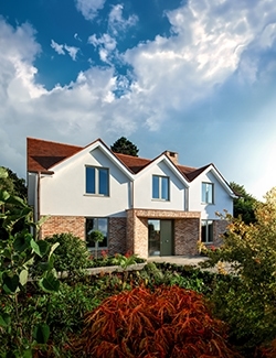
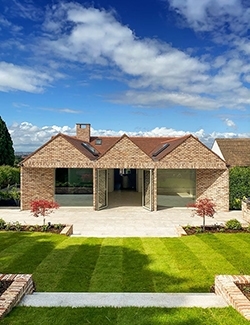
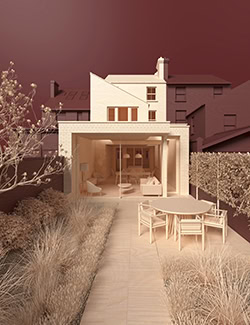
Garden Facade
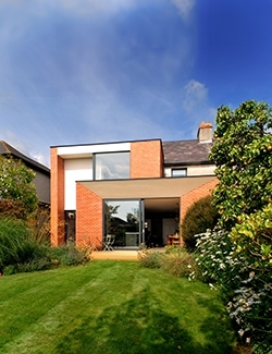
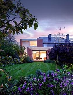
The rear extension blends indoor living with the garden, featuring a contemporary brick façade that complements the original house and creates a calm space for relaxing or entertaining.
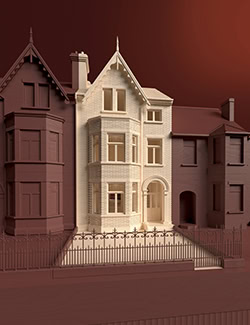
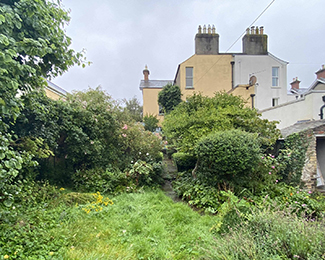
Before
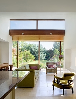
Indoor-Outdoor Living
Tall three-part glazed sliders connect the interior with the patio, bringing in natural light and creating a smooth flow between indoor and outdoor spaces.
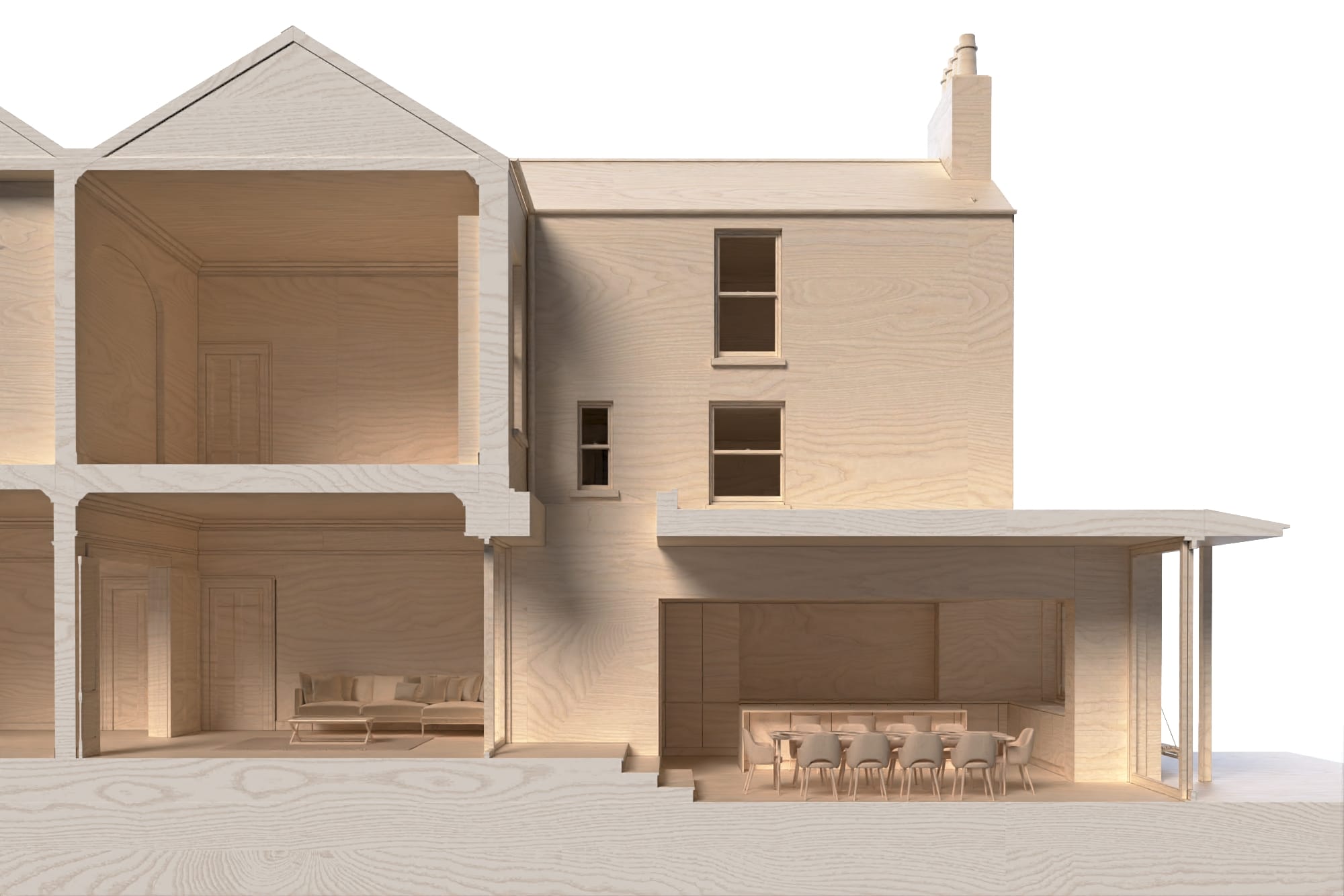
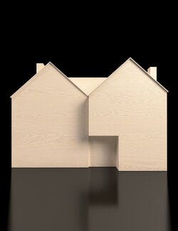
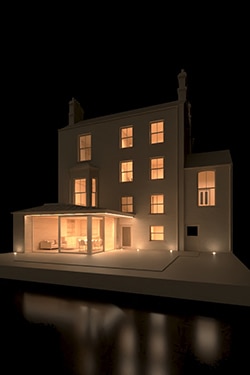
Digital Model Image

Suntrap shading
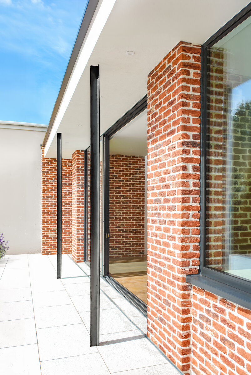
The facade's brick piers, aluminum glazing, and steel posts create a balanced aesthetic. The canopy roof provides shading, protecting from sunlight while maintaining an outdoor connection, keeping the space cool and comfortable.
Under the Magnolia tree
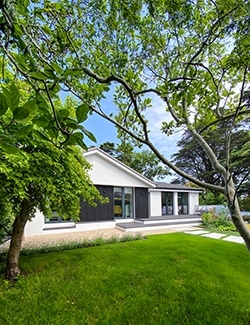
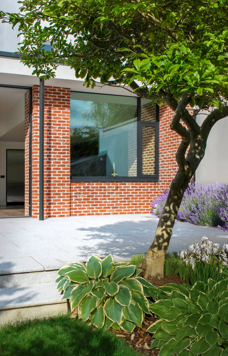
The kitchen window overlooks a sheltered patio, perfect for barbecues. Nestled under a magnolia tree, this area offers privacy and garden connection, making it ideal for outdoor cooking and relaxation.
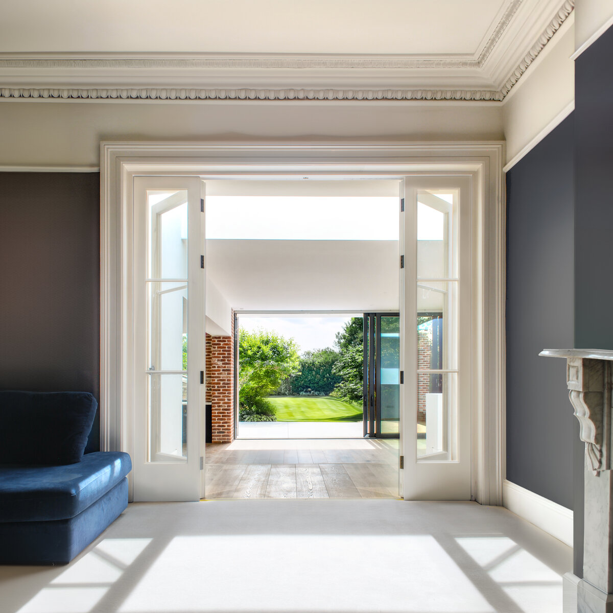
Linking old and new
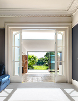
The design links house and garden, blending old and new. Fully open doors create a seamless flow, ideal for family gatherings.
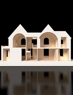
Digital Model Image
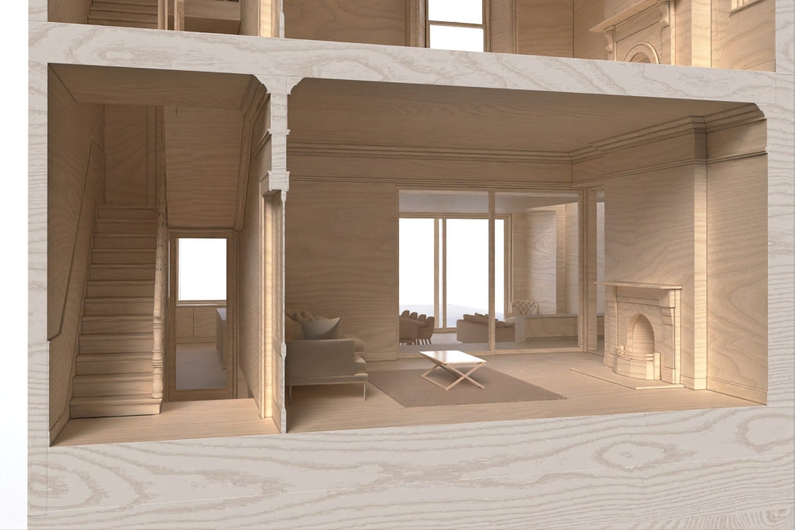
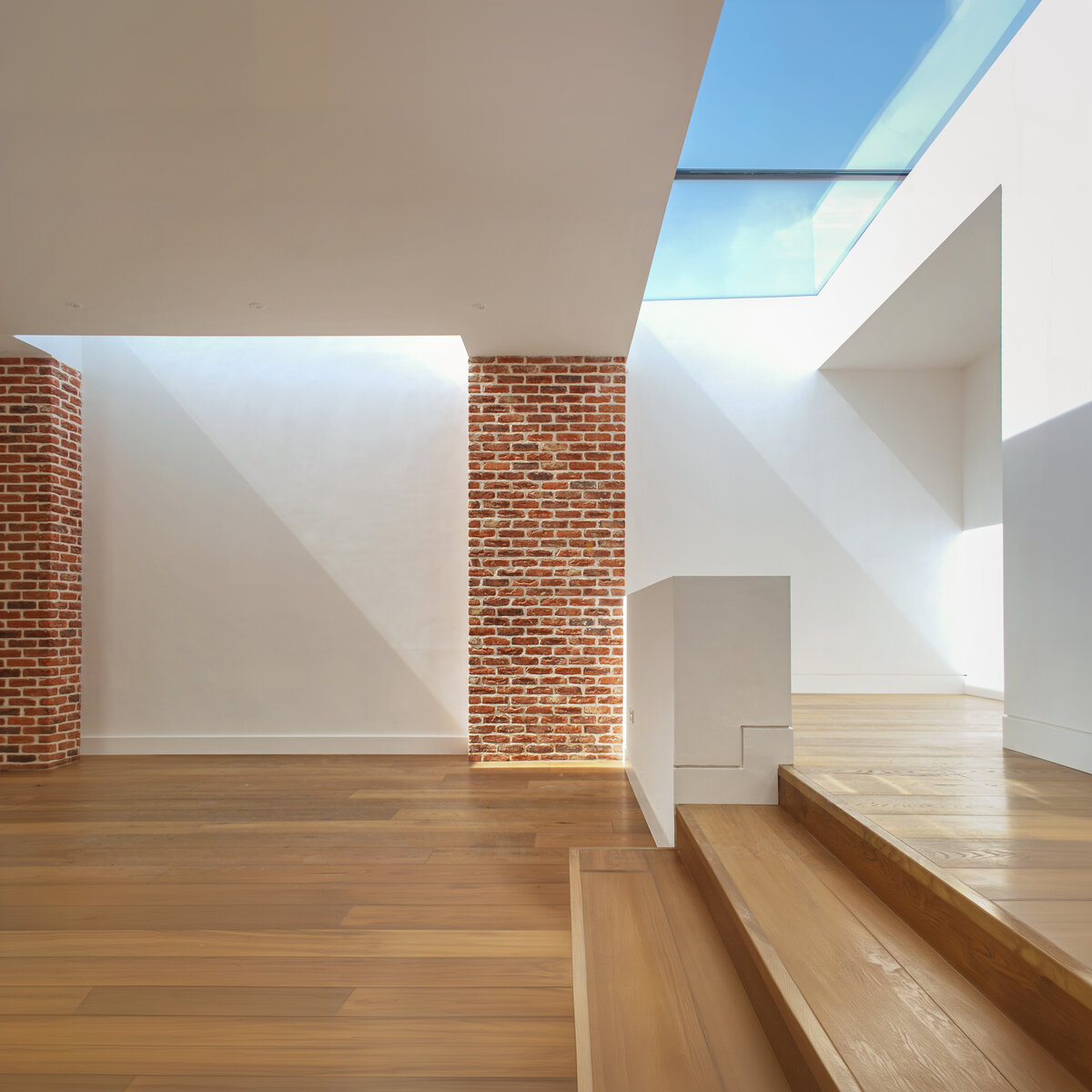
Stepping into Light
The rear floor level aligns with the original, connected by broad steps. Elevated ceilings enhance the space, and rooflights ensure natural light fills the area, creating a bright, welcoming atmosphere.
Digital Model image

Dramatic toplighting
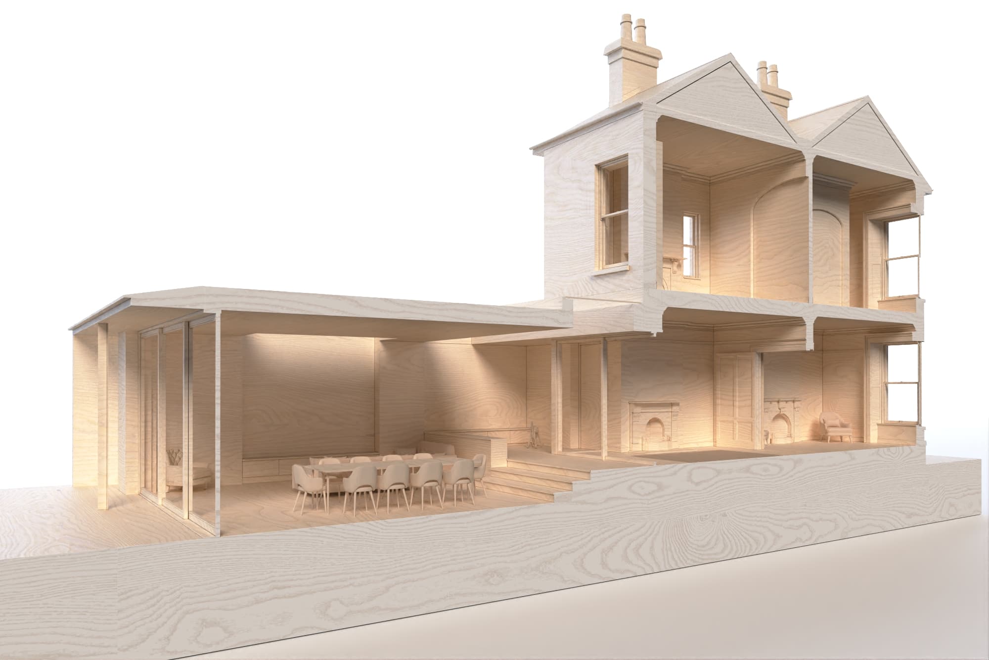
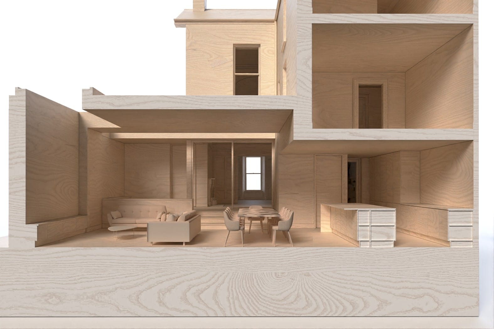
The new extension, positioned between the three-story rear return and two-story main house, features a deep floor plan. Large rooflights brighten the space, keeping it light-filled and welcoming throughout the day.
Digital Model Image
>
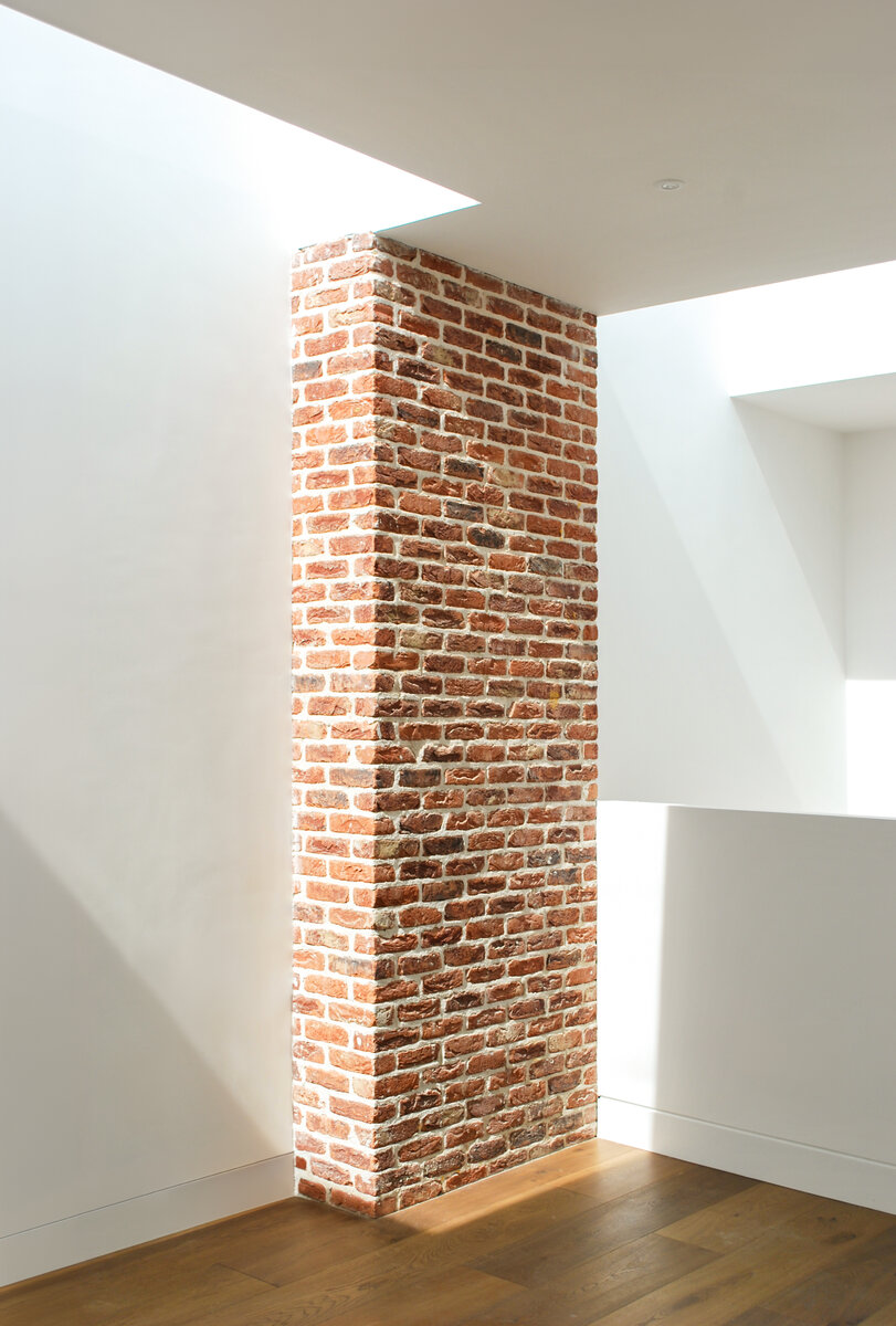
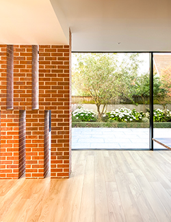
Inside Out Brick piers
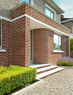
The rear facade's brick piers extend into the interior, linking inside and outside. Tumbled, textured bricks, chosen for their vibrancy in sunlight, replace the traditional Victorian practice of using lower-grade bricks at the rear."
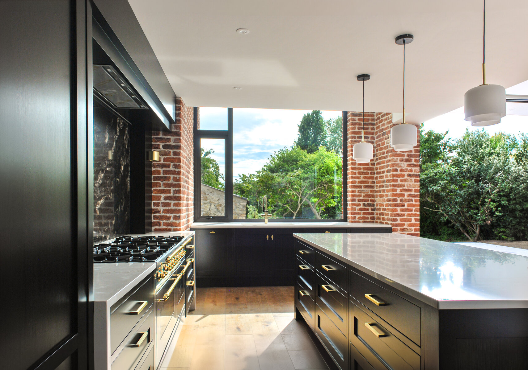
Kitchen view to garden
Lying in the bottom of the rear return, we raised the floor above to increase ceiling height in the kitchen, which is centred on picture window overlooking the garden.
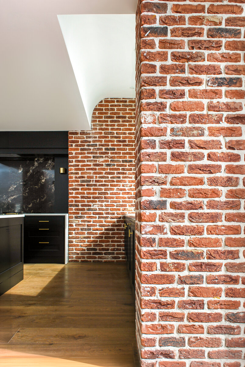
Rising Above the Ordinary
In the sink area, we raised the ceiling height to create a greater sense of space and introduce a subtle yet impactful architectural feature. This elevation not only adds to the room's openness but also brings a touch of understated drama to one of the kitchen's most functional areas.

Contrasting Details
Textured brickwork contrasts with sleek black cabinetry and black-and-white quartz stone, creating a dynamic kitchen. The warmth of the bricks complements the modern elegance of the finishes.
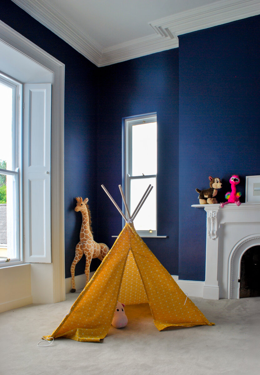
Around the fire
The project preserved a safe fire escape from a principal bedroom despite the rooflight. A new small window on the original gable ensures emergency egress, maintaining the room's charm and functionality.
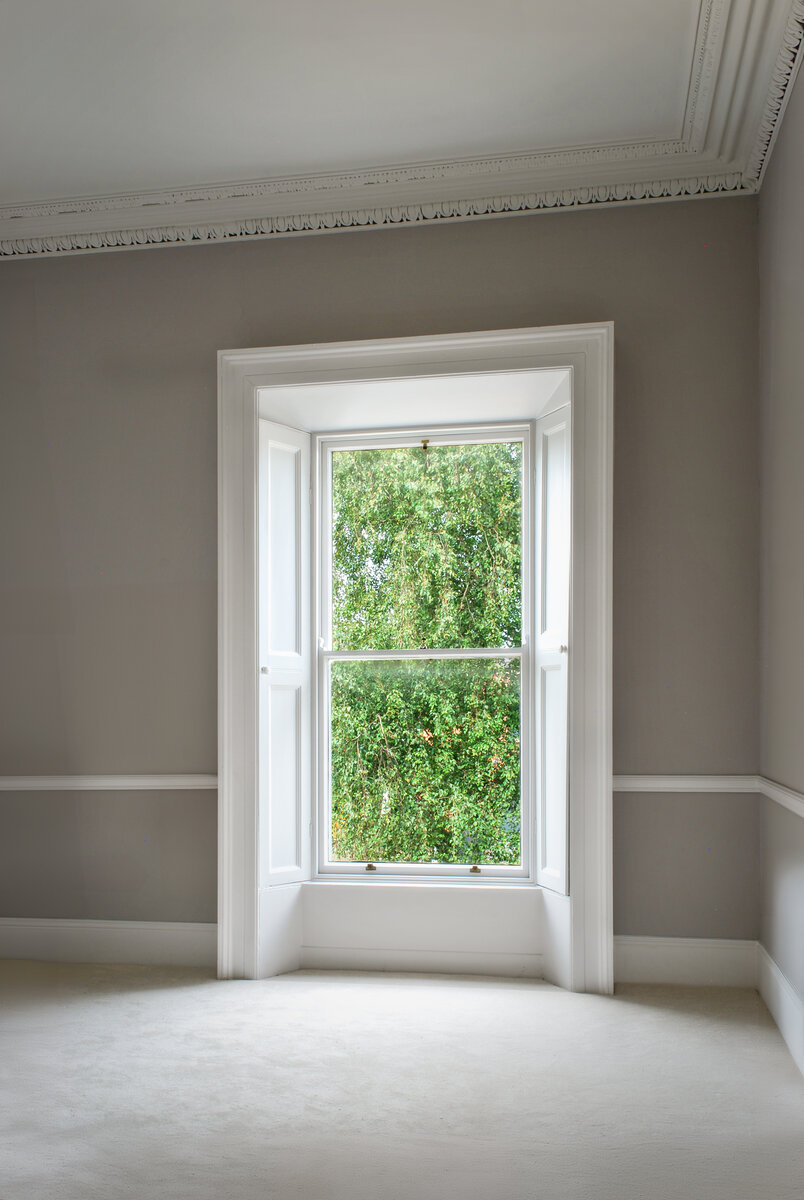
Hidden Restorations
Old houses often require unseen but essential repairs. This project involved careful refurbishment, preserving the original structure's character while meeting modern comfort and safety standards.
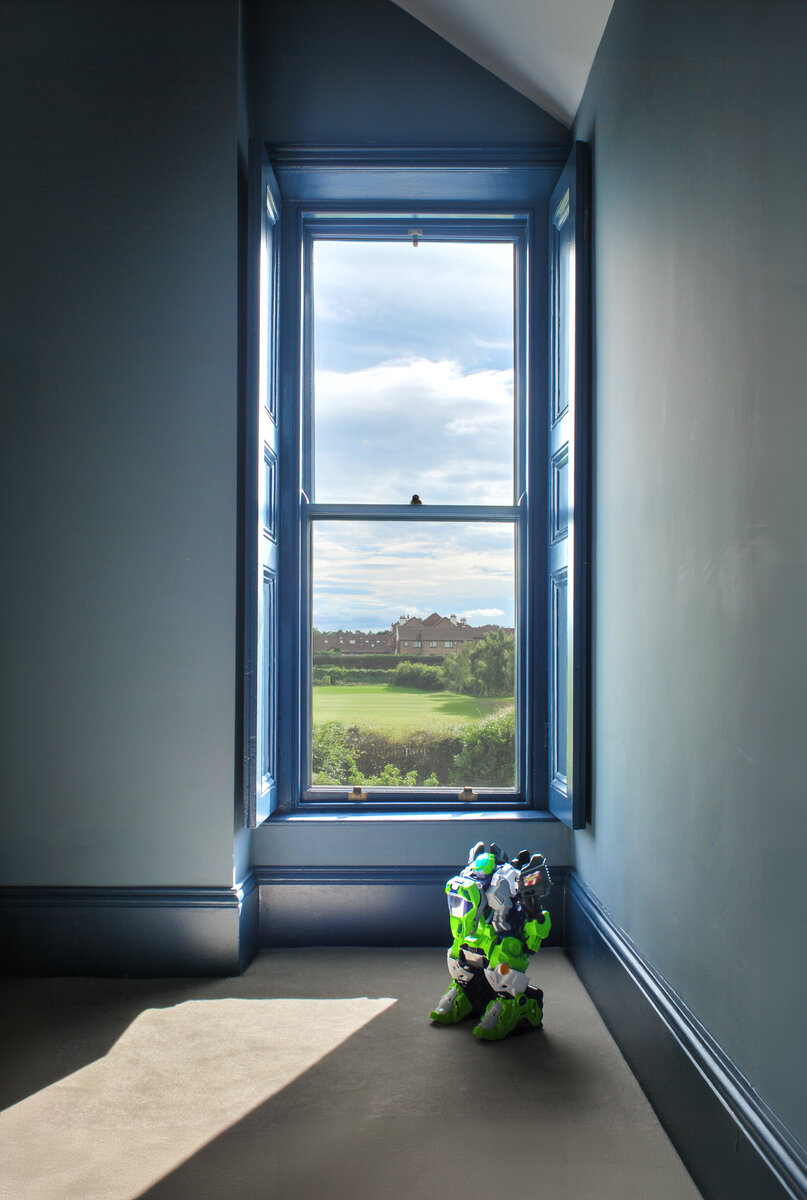
The Robots are Coming!
A child's bedroom, bathed in natural light, features a charming window with a view of the outdoors. The vibrant blue window frames add a playful touch to the room, creating an inviting space where imagination can thrive, whether it's a quiet moment of reflection or an adventure with favorite toys.
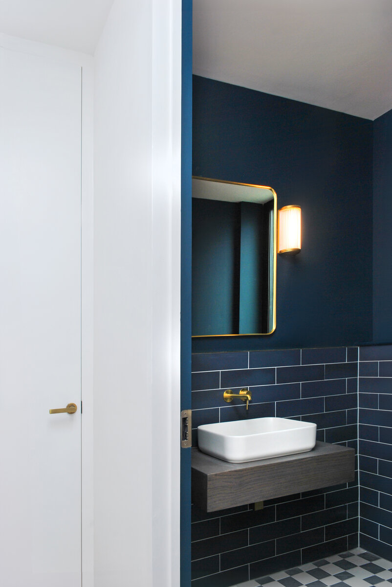
Enhanced Facilities
Victorian houses are often surprisingly underprovisioned for basic day-to-day requirements. The side extension to this house includes a children's play / storage area, visitor toilet, utility room and home office.
Merging old and new
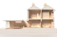
Stepping down from the floor level at the front of the house to the lower original floor level at the rear, old and new are joined on either side of a large new lightwell roof light that ensures daylight continues to pour into the original house.
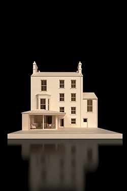
Before
An old addition to the rear is to be removed as well as opening up the back of the original house.
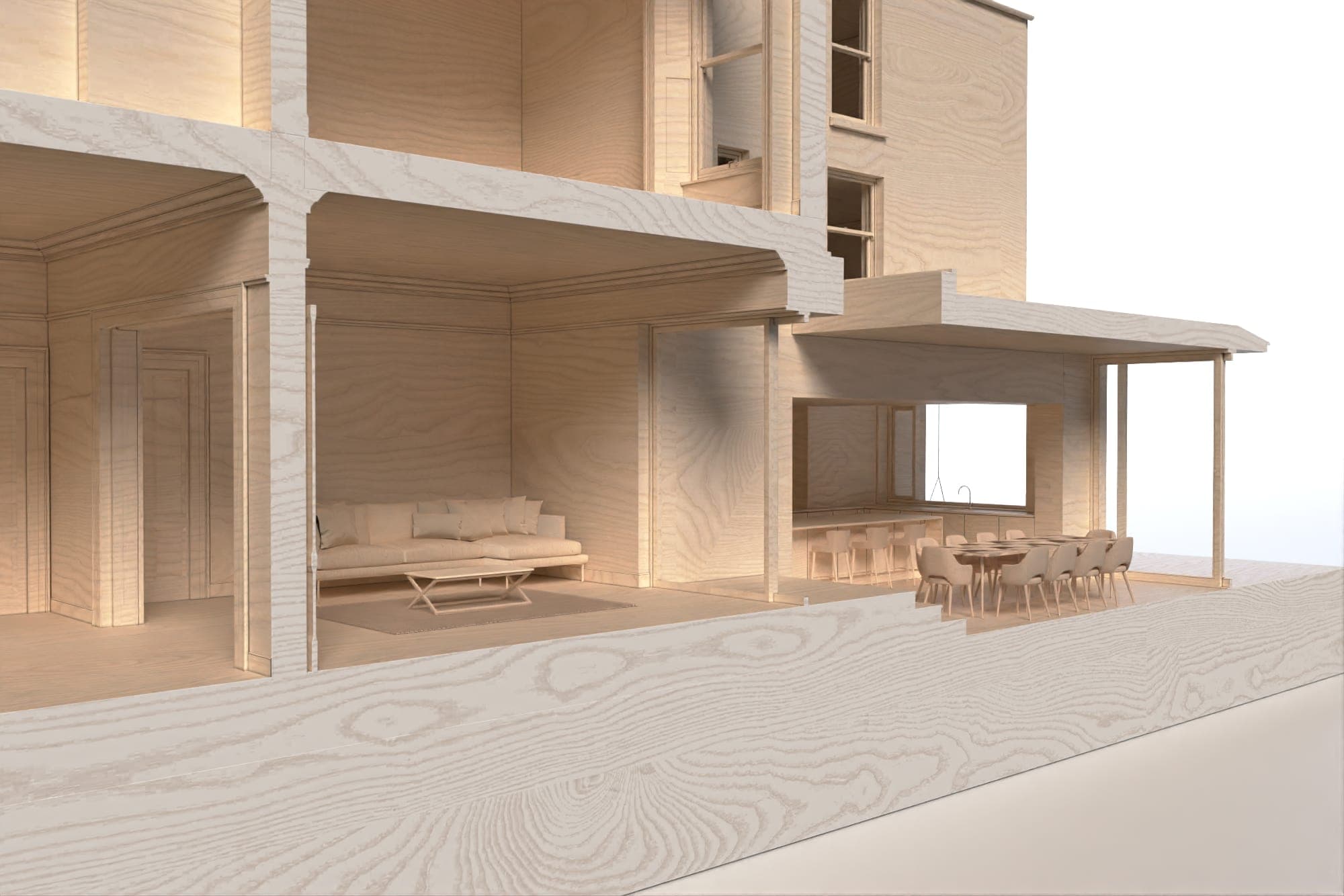

Ceiling heights
The challenge with any old house is to create contemporary living spaces of a scale comparable to the original formal reception rooms.
In this instance, the new roof over the ground floor extension area steps up higher than the old ceiling level to the back of the original house, ensuring a generous flow of space throughout.
Before
An old addition to the rear is to be removed as well as opening up the back of the original house.
